
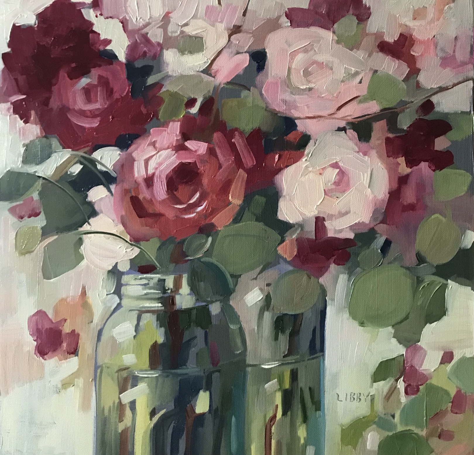
Thursday, December 15, 2022
CELBRATION STORY

This painting is a little different from most of my others. It has a little more of a graphic feel to it. One of the artists of the past that I admire the most is Henri Matisse. The thing I love most about his work is his use of pattern. I enjoyed adding pattern to the vases in this painting to add interest.
Monday, September 19, 2022
PERFECT TIME

I haven’t posted in quite a while.Painting and solo and group shows have taken up a lot of my time. Plus Life in general. I do enjoy taking a little time to talk about a single painting though. Along with flowers I do love chairs. The combination is perfect. Wouldn’t you love to come home to a basket of beautiful flowers waiting for you in your favorite chair? A perfect time
Saturday, April 9, 2022
Where Will You Go?

I do florals more than landscapes; but my landscapes often have some florals in them! This landscape has some mystery because of the path that disappears into the darkness. No one knows exactly where it goes- it is up to the viewer’s imagination.The path leads the viewer into the picture plane and all around it. The colors chose add to the calm feeling of the painting.
Friday, March 11, 2022
Carlotta

Sometimes the title for a painting comes to me after a painting is finished. As soon as I fnished this; the name Carlotta popped in my head. She is a character in a book series by Linda Barnes about a private investigator who solves various crimes. She is a colorful redhead who invokes the kind of colors present in this painting. The neutrals are only present in the greens and background, allowing the flowers to pop!
Tuesday, March 1, 2022
Kindness

I chose bright , light colors for this painting with very few darks. I was trying for an upbeat , happy feeling for the painting. Everytime I use aqua in a painting that seems to be the outcome; I don’t know why. I guess because it is a kind of blue but with a little kick to it by adding the green. Kind of like a fun day at the beach. I would like to audit a good color theory class some day. Not for a grade; just to absorb some of the knowledge. There are so many things to learn; so little time!
Monday, February 28, 2022
SPRING UPDATE

I haven’t posted in a while. I misunderstood that the blog was going to be discontinued. It was just the mailing list. In the meantime I have still been painting every day. Last week my Instagram account ( @libbybob) was hacked by a bitcoin hacker making it seem that I was asking people to invest in bitcoin. I am trying to resolve this but in the meantime I have opened a new account named @was_libbybob
So please follow me on that account; no bitcoin allowed!
Wednesday, June 9, 2021
WILD MEADOW

This is a closeup of a flower meadow.The dark background adds depth; making the viewer wonder what else is behind the flowers in the front. The colors pop because of the neutral greens with the surprising yellows.
Monday, June 7, 2021
Parallel Parking

I did not have to parallel park for my driving test and I avoid it when possible. I drive around the block for 20 minutes or park 3 blocks away also to avoid it. These bottle vases remind me of that parking situation!
Monday, May 31, 2021
Lost in the Garden

I do floral compositions more than landscapes but do enjoy landscapes as a change of pace. This landscape combines my love of flowers with the outdoors. The flowers draw the viewer in toward the buildings as the blooms get smaller as they recede.
Saturday, May 29, 2021
Summer Romance
Viewers often ask if I draw my subject before I paint. I usually take a brush and a thinned color from my palette to block in the placement of the basic shapes. If I was a beginning painter I might do a lot of preliminary sketches but I have been painting for so long I have a pretty good idea for placement and scale. Since I am using oil; I can also just wipe it off if I don’t like it. I find that I have a fresher painting if I don’t have a tight drawing that I am trying to follow.
Saturday, May 22, 2021
Likewise

These vases had a kind of 1950’s vibe to them ; what you might have had flowers brought to you in the hospital as you recovered from some kind of surgery or maybe a baby being born. They may have sat on the window sill for a week because as you know back then hospital stays were at least that long. Now you go in for heart surgery in the morning and they send you home in the afternoon. Not that modern medicine is so great— all about the money!
Tuesday, May 18, 2021
Daily Story

My favorite part of this painting is the white flowers. They are the star of the show and spice up the neutral colors of the flower arrangement. Without the white the lovely purples and blues wouldn’t sing as beautifully. A lesson to all of us that we need each other!
Sunday, April 25, 2021
One More Silver Dollar

The title may seem strange to you but titles just come to me sometime out of the blue.A lyric from the song Midnight Rider popped in my head for some reason. My favorite thing about this painting are the way these colors harmonize with each other. It could be an accident but maybe years of experience play into it. That said, I have many day of painting where I wipe off many paintings and start over. It is never easy!
Tuesday, March 16, 2021
Good Idea

Colors that an artist chooses tend to convey the message of a painting.This painting doesn't have the most brilliant colors available but certainly not a New England feel. I would expect this to be from an island home or some tropical destination. There are neutrals, but just enough necessary for the eye to rest.
Friday, February 19, 2021
Peace

Several years ago we visited England. We started in Manchester, visited London and ended up in the Cotswolds. It was a picture book version of old England. The thatched roof cottages, sheep in the meadows and high tea and scones with clotted cream.This idyllic view reminds me of the magical time we had on our trip.
Tuesday, January 26, 2021
Blue Table

I have painted sunflowers many times before . This is a different view; it is a back view and shows the flowers backlit. One way to make a statement in art is to think outside the box. It might be by using different colors or a different point of view.
Sunday, January 17, 2021
Summer Backyard

Although it is the middle of winter; I choose a summer landscape to display. A few years ago I started doing a series of meadows or fields of flowers. The point of view is what a person or animal would see at eye level of the plants and flowers close up and also at perspective. This view is very close up as if a rabbit is looking through the flowers. Maybe the next painting may show the viewer!
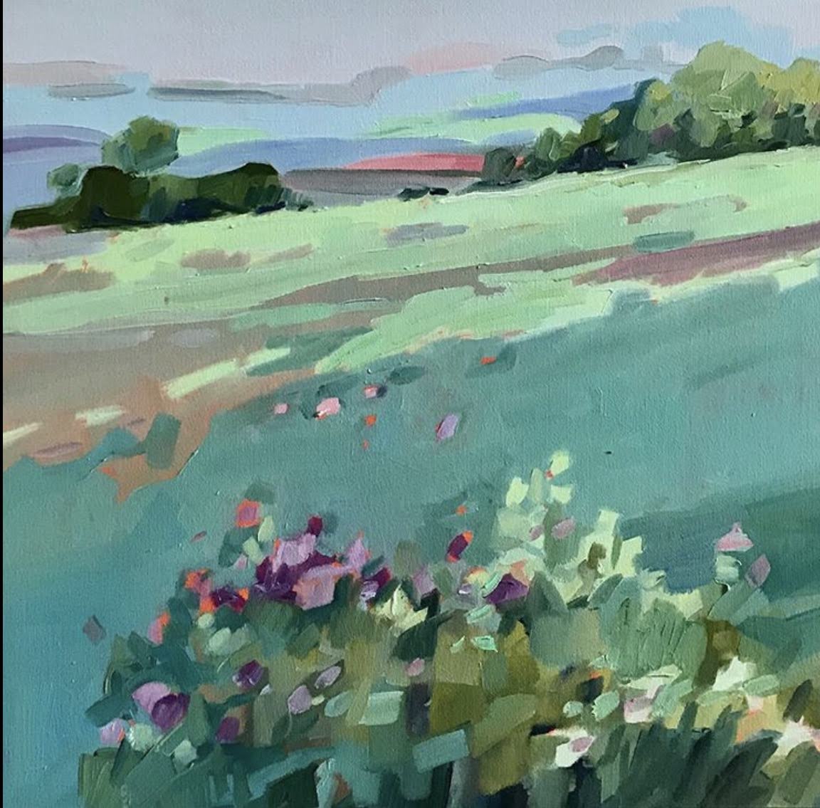
Saturday, October 17, 2020
Agreeable

I like choosing multiple objects in a composition. It works well to vary the size of the objects to make the painting more interesting. Another good rule of a painting is to choose an odd number instead of an even number. The even number of things seems to divide the space up into two areas and moves the eye out of the painting.
Tuesday, October 13, 2020
Top of the Ticket

Composition in a landscape usually relies on some kind of perspective. There is most often a view that shows distance;foreground, middle ground and background. This landscape adds another element which is light and shadow. Hopefully I was able to show the effect of sunshine hitting the meadow.
Friday, May 29, 2020
For the Beauty

Wednesday, May 27, 2020
Red Tree

. This guarantees an immediate attention getter, a position that is not dead center in the composition is important too.
Friday, May 15, 2020
Life Instructions

Tuesday, May 12, 2020
Remember Me
Sunday, May 10, 2020
Game On

which adds a texture of its own. I choose to try to create texture by the use of value and brush strokes. in this painting there is a variety of texture. Smooth texture is in the blue cloth in the foreground which contrasts with the rough nubby texture of the basket. The flower petals would feel smooth to the touch but the way they are tightly layered would give them a ruffly feel If touched.
Friday, May 8, 2020
White Emperor Tulips

Wednesday, April 29, 2020
Midnight Fiesta

Tuesday, April 28, 2020
One Steo Ahead

Saturday, April 25, 2020
Blues Club
to me.It took me a long time to figure it out. It was the background ; which I had painted a golden color. I realized what it needed was a little more drama so I gave it a dark background and it made all the difference. It spoke to me; I finally listened.

Make a Deal

Subscribe to:
Posts (Atom)