Hydrangeas are often a subject of my paintings; whether growing in a garden or in pots or containers.The colors vary from white to blues and pinks and purples.They are a challenge to me but I still try to paint them again and again hoping I will get better each time. I do love the process.
Sunday, July 28, 2019
Thursday, July 25, 2019
GARDEN WALK
This past month has been the longest I have gone without posting on the blog. We have been traveling quite a bit and spending time with grandchildren. I have been painting in between though and entering shows. This painting is for a show at the Botanic Garden next week.. I love to paint garden scenes. I imagine that I can walk right in there and smell the flowers!
Sunday, June 30, 2019
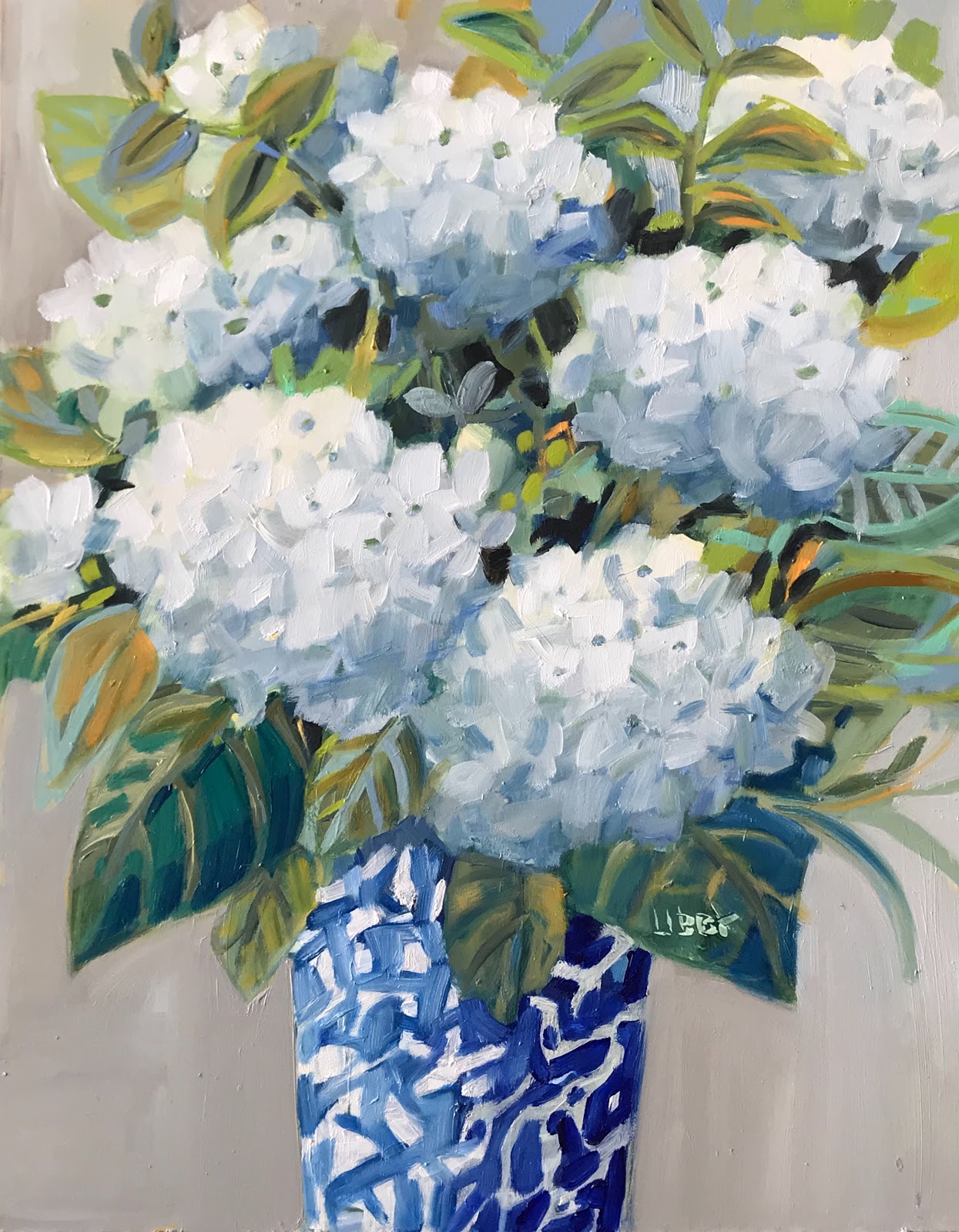
Dancing Whites
The summer months are the time to see hydrangeas everywhere. I have a friend who spends the summers in Maine every year.She has gorgeous hydrangeas in her yard but doesn’t get to see them bloom. She graciously told me I could go and cut some to take home and paint. I love every color; the pinks, purples and blue. But the white ones are especially beautiful paired with a blue and white vase.
Tuesday, June 4, 2019
Tuesday at the Beach
Looking for shells at the beach is something that the kids never grow tired of. Some days yield more than others. They are beautiful but can a have an oceany odor to them, especially when they haven’t bee throughly washed. Our daughter was wondering why her bedroom in the beach house had a peculiar odor. Her 10 year old daughter Rylee had hidden her bucket of shells in her drawer so as not to be pilfered by younger cousins. yikes! They are now on the porch.
Sunday, May 19, 2019
How Wonderful Life Is
My favorite thing to paint again— mason jars. The aqua ones are especially beautiful paired with any color flowers. I just can’t resist.
Monday, May 13, 2019
I Got You Babe
I have painted with this color combination before.Although yellow and blue are not complementary colors the two colors together are very pleasing.I did an approach to this painting in a whimsical style. This gives a feeling of movement and excitement in the painting.
Sunday, May 12, 2019
Exceptionally
We have been doing some remodeling and home repairs lately so I haven’t been posting much. When I say we I mean professionals are doing it and we are watching. But it is still disruptive. A few days ago I was blocked from my studio so I worked on some watercolors at the kitchen table. I haven’t used watercolor in a long time but it all came back to me. Art is art.
Monday, April 22, 2019
I Think You’re Pretty
Of course here is another garden painting. I feel there are endless ways to paint these garden or wildfire paintings.It is mostly intuitive in that I just go with the creative flow. The end result is usually unrecognizable from the reference drawing or photo. Always a surprise!
Monday, April 15, 2019
Great Outdoors
My good friend took a photograph near the Tennessee River Park in east Tennessee. I was struck by the wonderful movement that I saw that made me want to paint the scene. The white flowers are the center of interest in the painting but other elements draw the eye into and around the rectangle ending with the setting sun. I hope viewers are drawn into the painting and enjoy time spent there.
Saturday, April 6, 2019
Manor Blooms
I don’t know how many times I have painted hydrangeas, but I never tire of painting them. At first glance they appear to be simple enough. The challenge is to give each bloom a spherical form. This is done mostly with value.The light usually hits on top or to each side so the bottom part is usually darker. I remember in college painting a live model. Our professor was trying to teach us to draw a head with volume. More than 40 years later I remember the elation I felt the exact moment I got it! Money can’t buy that feeling. I still feel that way when I paint something I am proud of. The secret of life is always having something else to learn or discover.
Saturday, March 30, 2019
Summer Stage
Paintings usually have a kind of temperature.A painting of a field of sunflowers or a fall tree scene would usually have a warm temperature. This painting of summer flowers has a few warm colors in it but the overall temperature is cool. Although there are greens ; the colors are intentionally grayed and blue toned. It is usually something I decide before starting the painting but often it just happens as I am painting— like a Ouija board taking over!
Thursday, March 21, 2019
Geranium Window
Geraniums seem to strike a chord in people. I think it is not just the bright reds and pinks but also the sturdy cheerful nature of the plant. Compared to some of the more delicate flowers that bloom at the same time, these flowers are the work horse of the garden. Rarely are they seen just growing in the flower beds. They are very content to sit in pots and hang from porches to proclaim that summer is here.
Friday, March 15, 2019
Nostalgia
This painting called for a more subdued color palette. Because I was painting this old fashioned vase and roses the soct greens and pinks were more appropriate. I sometimes go to some of the big antique malls that have different booths for sellers. It is a little overwhelming to see so many objects displayed there. This vase is an example of the kind of thing someone might find that probably belonged to a grandmother long ago. It is hard often to evoke a mood in a painting but this one was easy to do that just with color.
Sunday, March 10, 2019
Side Effect
I try to dabble in abstraction but it is not as easy as it looks. I love abstract painting because the colors and shapes evoke an emotion in me. These flowers are not extremely abstract but they are not an attempt at realism. I figure if I just keep at it I will get there!
Saturday, March 2, 2019
The In Crowd
I like close up views more than far away views. This painting just shows a partial view of the bucket and some of the flowers.It gives a better view of the shapes and colors and becomes more abstract so that the important things are the essence of the painting.
Sunday, February 24, 2019
Up For Grabs
Every painting is not an instant success.I finished this painting and looked at it for a few weeks but was not pleased with it.If I am not drawn to the painting I figure no one else will be. So I changed the flowers and some of the colors in the bottles. I can now look at it and feel at home.
Friday, February 22, 2019
Fresh Faces
Certain color schemes cause a little thrill in me.I love the reds and pinks of the flowers but when combined with the blue and white vase something occurs that I can’t explain. Maybe magic; whatever it is I am lucky to be able to get to do this “job”.
Thursday, February 21, 2019
Done Deal
This floral painting of a field of poppies is what I consider to be mostly abstract. It is still recognizable as flowers but on close examination is just different colored shapes that build up to create a meadow that reads as flowers. To me it much more interesting than a truly photo realistic version of flowers.This method seems to move the way the flowers might on a windy day.
Monday, February 18, 2019
Reminds Me of You
The thing I like the most about this painting is the immediate sense of pleasing color. I have to admit that I didn’t exactly plan it that way. Of course I had in mind certain colors that I knew would complement each other and I had an underpainting that would also work with the colors.But things don’t always just click but this one did. Now I want a dress with these colors, and a sofa and maybe some shoes.
Saturday, February 16, 2019
Hide and Seek
I am back to the meadow painting again; this time with brighter colors. I started with a warm underpainting that sometimes peeks through the top layers of oil painting. In this kind of painting I do try to do it all in one session but often come back the next day to add some fine line details like stems and grass marks that work better after the first layer has dried a little. The title Hide and Seek applies tothe fact that there is depth to the painting- the more you look at it , the more there is to see.
Saturday, February 2, 2019
Zinnia Zing
Zinnias are in my top five favorite flowers. Who am I kidding; my top five is much larger than Five. I love the shape of the petals and the variety of colors is thrilling, they all complement each other.The flowers are so bright and cheerful; the stems are sturdy and long lasting. This aqua vase is the perfect container for these flowers. Perfection!
Thursday, January 31, 2019
Hey Good Looking
This small 8x 10 painting is a close up perspective painting. Although it doesn’t lead the eye down a long road as in a landscape, it does take you through the picture plane. Because of the size of the pots, most viewers start looking on the left and travel to the right toward the smaller pot. The break in between allows for a rest for the eyes. All of these decisions are conscious but after years of painting just happen without much planning.
Sunday, January 20, 2019
Lost Meadow
The title Lost Meadow tries to convey the feeling that no humans are around or have had occasion to have been here. The beauty of the meadow and the view of the distant mountain are just there for the sake of nature. Perhaps someone will soon come along to discover it and hopfully not spoil the beauty.
![]() |
Friday, January 18, 2019
Hot Topic
I often finish a painting in one session and am satisfied with it. I thought I had with this one. I kept walking by it and a feeling like something just wasn’t right. I did this for a few months because I couldn’t quite figure out what it was that bothered me. This week I decided to be brave and put it back on the easel . I just started adding colors and changing areas realizing what the painting needed was some depth. One of the hardest things is to know when to stop!
Monday, January 14, 2019
Impact Statement
There is something to be said for drama in a painting; especially when dealing with a subject matter like flowers. Flowers are by nature not necessarily an exciting subject matter. But the way they are painted can make them seem to be. One way to do that is by use of contrast of dark and light colors. In this painting there is a natural light color in the white hydrangea. By using a dark blue in the background, the white really stands out in the painting with a lot of drama.
Friday, January 11, 2019
Winter Protocol
Painting white flowers requires a restraint and a skill to use subtle color. If you look closely you will see many color in the whites including many neutral tones. White reflects the colors around it so unless the white flowers are in a snowbank in the arctic they will be full of color. That arctic painting would be very boring!
Wednesday, January 2, 2019
Well Done
I love bright colors but this painting is more about complementary colors. What pleases me most about the painting is the relationship between the greens and the reds and the pinks. This is the reason nature is so beautiful; complementary colors occur naturally outdoors. No one has to arrange the colors- - they are already there. When arranging an indoor still life some care has to be taken though. If everything in the arrangement was a bright loud color, one’s eye would have nowhere to rest. That is why I use plenty of neutral colors like gray and also complementary colors to create perfect color balance.
Saturday, December 29, 2018
Bench In The Garden
This painting shows a little more perspective than I usually do when just painting a floral. As a landscape there is a bit more depth shown because the bench is in the distance in the garden. The intent is to lead the viewer’s eye through the oainting to the center of interest.
Tuesday, December 25, 2018
See you on The Other Side
There seems to be a trend now for paintings of whote flowers. I think it is because gheyare looked on as being neutral which fits into a lot of decoratinb shees.This is fine with me but I should remind the viewer that white isnever just white..I see all kinds of colors in these late fall flowers
Thursday, December 20, 2018
Trade Deal
the varirty of blues in the world is amazing. The good thing is that when using them in a painting you really can’t go wrong. The colors qualify as analogous colors ( neighboring colors) so they always go together. For this painting I used a cool light ultramarine with a blue green. Perfect!
Subscribe to:
Posts (Atom)