This painting shows a little more perspective than I usually do when just painting a floral. As a landscape there is a bit more depth shown because the bench is in the distance in the garden. The intent is to lead the viewer’s eye through the oainting to the center of interest.
Saturday, December 29, 2018
Tuesday, December 25, 2018
See you on The Other Side
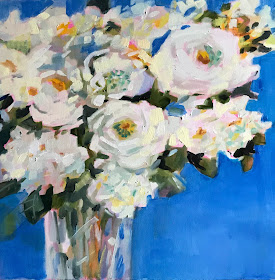
There seems to be a trend now for paintings of whote flowers. I think it is because gheyare looked on as being neutral which fits into a lot of decoratinb shees.This is fine with me but I should remind the viewer that white isnever just white..I see all kinds of colors in these late fall flowers
Thursday, December 20, 2018
Trade Deal
the varirty of blues in the world is amazing. The good thing is that when using them in a painting you really can’t go wrong. The colors qualify as analogous colors ( neighboring colors) so they always go together. For this painting I used a cool light ultramarine with a blue green. Perfect!
Wednesday, December 19, 2018
Color Theory
i painted this large 30x 40 acrylic painting for my solo show at the Botanic Garden. The flower theme was perfect for the setting on the garden. The painting reminded me of the colorful artwork of Peter Max in the 70’s. If you aren’t familiar with his work, look it up. Think Beatle’s Yellow Submarine. It was fun- Everything came straIght from my imagination.
Saturday, December 15, 2018
ALL RIGHTS RESERVED
When I first started painting it was the shapes of the flowers that was intimidating.After I felt comfortable with those it was glass that was the next hurdle - usually mason jars or smooth glass vases. Of course the next hard thing was cut crystal like this vase. But I finally realized it was just about shapes and colors.You paint what you see, not a vase or flowers. That is why learning to draw upside down is so effective. Of course that only works with photographs unless you are an acrobat!
Thursday, December 13, 2018
Made for You
Backgrounds can totally make or break a painting. Originally this painting had a solid blue background. It seemed a good choice because the foreground was pretty busy with the flower pots and flowers and needed a restful space for the eye to rest. I looked at it for a few days but wasn’t satisfied with it and then I remembered a Carla O Connor workshop I attended in California a few years ago. She taught us about using colors close in value in backgrounds to create interest without taking the attention away from the subject matter. So I used different tints and shades of the blue to add subtle interest to the painting without shouting. It immediately became FRENCH to me, the ultimate in ooh la la.
Wednesday, December 12, 2018
All Dressed Up
One kind of balance is called Asymetrical. This means that if you divided the painting down the middle it would not be equal on both sides. To me it is a more interesting kind of balance but not as easy to do. There has to be enough weight of some kind on each side even if it is negative space. It just takes practice, practice , practice to make it look easy.
Saturday, December 8, 2018
Exceeds Expectations
There is a dilemma when painting a bouquet of multiple kinds of flowers. The many kinds and colors of flowers can be beautiful but also overwhelming. This is where some of the principles of design come into play. Repetition for example in this painting. The shapes and colors are repeated throughout to create a kind of pattern or rhythm. The mason jars are the same kind to create unity to tie the rest of the painting together.


